


Websites that look great and work right – all the time
 There’s recently been a fundamental shift in how your viewers look at your website. It used to be OK to design a website to look perfect on a large desktop computer screen. If someone wanted to see your site on a smart phone, well, they just had to horizontal scroll a lot. Well, people are through scrolling...
In 2010, smart phone sales moved past those of desktop and laptop computers, and in 2015 Google announced that they received more than half of search requests from mobile devices. If your practice website is not fully responsive, you’re risking losing your future internet audience – if they haven’t already left.
You can have the most comprehensive website with the best SEO features and great search engine page rank, but if someone finds your site on their mobile device and sees that they’re going to have to work very hard to make much sense of it, they’ll probably just keep on searching.
And Google has recently announced that they’re giving responsive websites top priority to searchers using a mobile device.
Why does it matter?
How our website would look when opened on an iPhone if it wasn’t responsive.
Substantial screen magnification and then horizontal scrolling is required for a meaningful view. It’s pretty easy to lose track of where you are at that point. Even easier to just click off and go somewhere else.

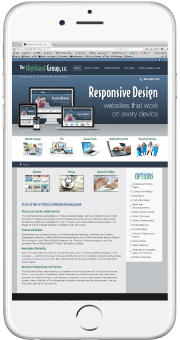
How our site looks now as a Responsive site.
Every text block, link, image and menu remains fully legible.
Try it on your phone!
How does it work?
Our Responsive Design Healthcare Websites are part of our Content Management System, with a much more complex underlying structure. The system can tell what size device a viewer is using, and resizes every element of the site to fit into the viewer’s window (or move it to the next line, if necessary). This ensures that all of your text and images remain totally legible no matter what size device they’re being viewed on.
Is your website responsive?

If it’s not, you need to consider an upgrade to a Highland Group Healthcare Website very soon. Just think about all those people trying to view your site on a mobile device right now...